Configuring Grid Layout tile-specific settings
To configure settings specific to Grid Layout tiles:
-
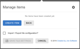
Create grid items using .
-
For each Grid Item, specify the following:
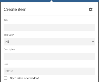
- Item Title
- Title Size: H1, H2, H3, or H4
- Brief Description
- Add a Link, with the relevant option to Open link in new window?
-
The Background type for a grid Item can be provided as:
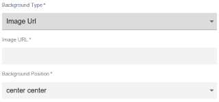
- an Image Url along with the Background Position. The Background Position displays the part of the
image, as specified:
- left top/center/bottom
- right top/center/bottom
- center top/center/bottom
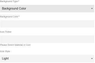
- a Background Color. Additionally, here a suitable icon can be selected from those available in the Icon Picker, along with an Icon Style (either Light or Dark).
- an Image Url along with the Background Position. The Background Position displays the part of the
image, as specified:
-
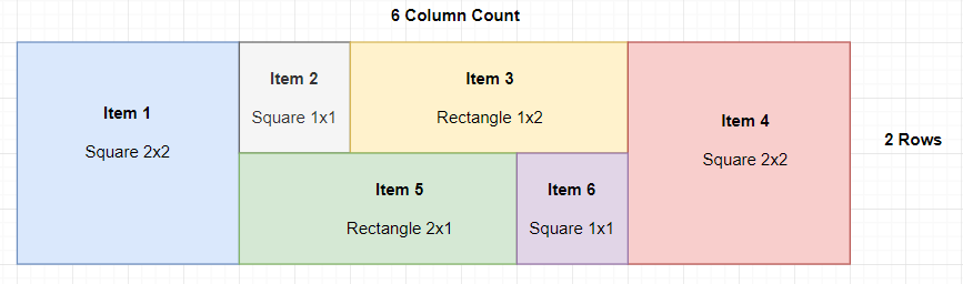
Select one of the following options to configure the grid Item Size:
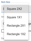
- Square-shaped: occupying: 2 columns/2 rows or 1 column/1 row
- Rectangular: occupying: 2 columns/1 row or 1 column/2 rows
Example:
-
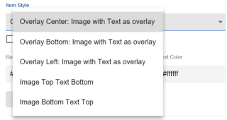
Choose an Item Style for displaying the grid item.
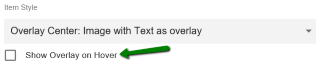
The Item details can also be displayed only on Hovering, if Show Overlay on Hover is configured.
-
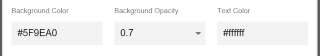
Specify the Background Color, Background Opacity (0.1 to 1.0) and Text Color per Grid Item.
Grid Layout tile is configured successfully.