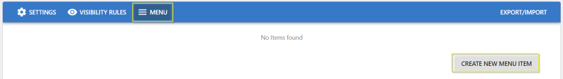
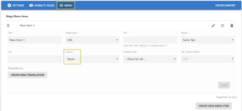
Elements of Menu Settings
Here you can find the menu settings that define the contents of a menu.
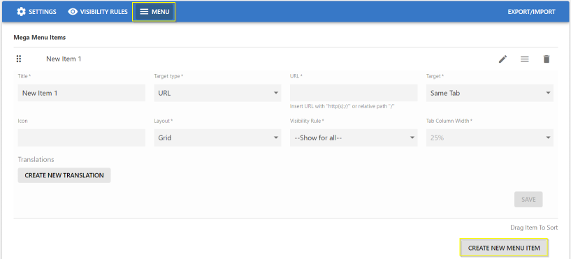
Main Main - Item:
- Item Title
- Item Target/URL Type:
- None
- Content Picker: Search and select a Jive content
- Place Picker: Search and select a Jive place
- Item Icon - Select Icon from Library
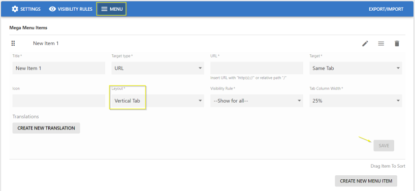
- Item Layout:
- None
- Grid: Menu - Sub Menus are displayed in a multi-column/row Layout
- Vertical Tab - Sub Menus are displayed in a single Column
- Tab Column Width
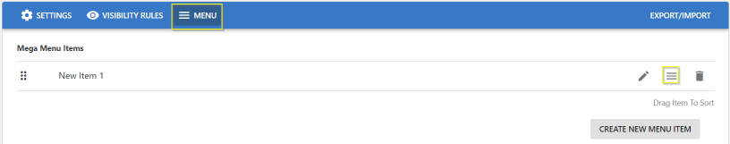
Use the manage icons:
- To edit (pencil icon).
- To add/access sub-menu items (three-lines icon).
- To delete (trash can icon).
- To re-arrange the item: drag and drop within the list.
Menus can be configured in various languages:
- Click Create New Translation.
- Select the Language in which the Main Menu is to be displayed.
- Provide the Title in the respective Language.
- Item Target/URL Type :
- None
- Content Picker - provide the content in the respective language.
- Place Picker - provide the Place, the user is to be navigated to.
- URL - Specify the dedicated target URL link (internal/external).
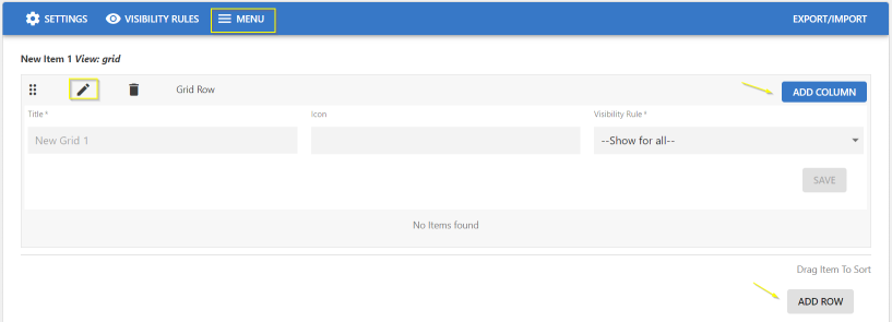
To create/access dropdown menus:
- Click the burger/three-lines icon.
- Click the pencil icon to add/edit details.
- Sub-Menu Title, Icon, Visibility Rule
- Click Save.
To create the Dropdown menus in Vertical layout:
- Select the Layout as Vertical Tab and set the % for Tab Column Width.
- Specify the other details: Title, URL Type (Content Picker/Place Picker/URL), URL(Place/Content/URL, Icon, Visibility Rules as appropriate.
- Click Save to save the Settings.
- To add more Dropdown menus, click Add Column / Add Row.
- To delete a Dropdown menu, click the appropriate trashcan icon.
- Click Save.
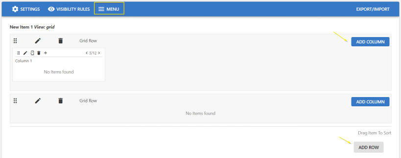
To create the Dropdown menus as a Grid:
- Select the Layout as Grid
Note: Tab Column Width is disabled.
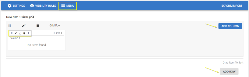
- In the screen, use the edit set of icons highlighted to:
- Pencil icon: edit the column and provide the sub-menu details: Title, URL Type (Content Picker/Place Picker/URL), URL(Place/Content/URL, Icon, Visibility Rules as appropriate
- Mobile icon: Show/Hide menu in mobile
- Trashcan icon: Delete column
- + icon: add another sub-menu/element.
This opens the Create Item screen
- Adjust the column width in the grid display by increasing/decreasing the parameter "< 4/12 >" or you can work with the numbers to decide the columns to be displayed a large/narrow column.
- Click Add Column / Add Row to add more columns in the same row or to create a new row in the Grid layout.
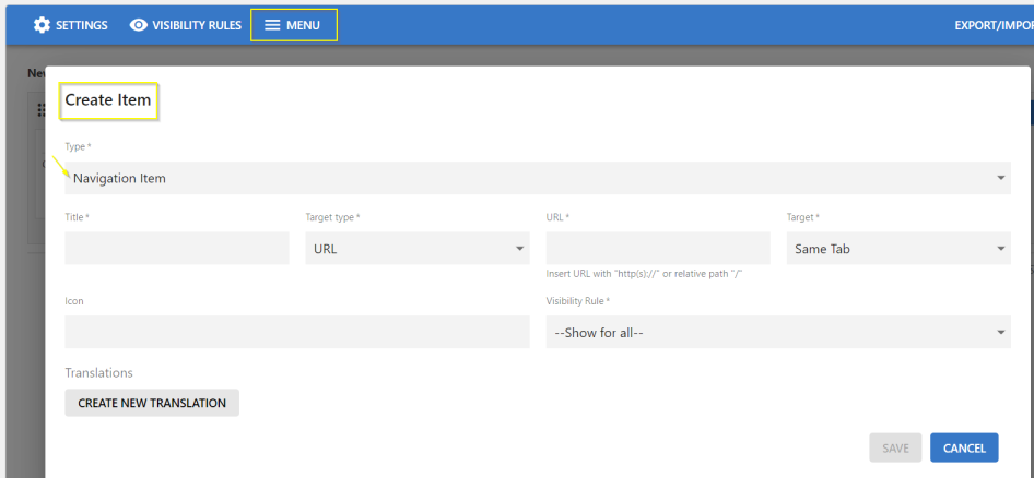
On the Create Item screen:
- Select Type:
- Navigation Item: Directs the user based on the Content, Place or URL configured.
- Image: Use this feature to illustrate images.
- Text: Can be used to add Text to an Image or to display a Preview text.
- Accordingly provide the other details on the screen: URL Type (Content Picker/Place Picker/URL), URL(Place/Content/URL, Icon, Visibility Rules as appropriate.
- To create the sub-menu in various languages, click Create New Translation and provide the specific details.
- Click Save to save the Settings.
- Click Save Menu Settings to save all the configured settings.
To create a Menu/Sub-menu as a Title which can be directly selected via a link:
- Select the Layout as None.
- Specify the other details: Title, URL Type (Content Picker/Place Picker/URL), URL(Place/Content/URL, Icon, Visibility Rules as appropriate.
- Click Save to save the Settings.
- Click Save Advanced Navigation Settings to save all the configured settings.