Using detailed view
In the sidebar of your content items, where you see the calculated metrics, click View More to open the detailed view of Impact Metrics.
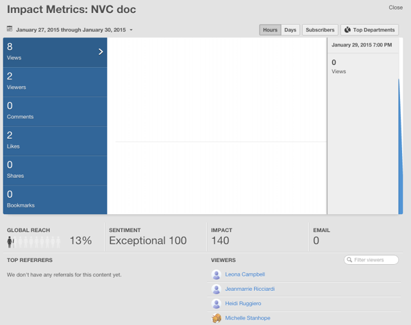
The Impact Metrics detailed view shows a graph with the number of Views, Viewers, Comments, Likes, Shares, and Bookmarks of your content by date. It also gives you the calculated metrics, which are the global reach, impact, sentiment, and email. For videos, Impact Metrics shows more specific details, such as an average duration of the view and retention.
Use these metrics to see how your content is being received in the community.
General metrics
- Global Reach
- Conveys how widely viewed your content is in your community. We use a calculation based on the number of registered users and include web and mobile views only. This calculation does not include those following content via email.
- Viewers
- In private groups, you see Viewers instead of Global Reach. These are the unique viewers who have looked at your content.
- Impact
- Shows how your audience reacts to your content by looking at their social actions, such as Bookmarks, Comments, Likes, Shares, and Views.
- Sentiment
- Indicates how well your content resonates with your audience. Content can achieve Neutral, Good, or Excellent sentiment based on social action and views.
- Report Dates
- You can adjust the report dates in the upper left corner of the detailed Impact
Metrics graph. Either enter a custom date range that focuses on a specific period of
time, or select a pre-configured report period that shows the first 7, 30, or 60 days of
publishing the content. Note: Impact Metrics are real time, so expect to see new viewers right way.
- Daily or hourly data
- When you click daily or hourly and then hover over the graph, you see data for more specific chunks of times.
- Show Only Subscriber Metrics
- If your community has the News enabled, then you can click Subscribers to see how many of the viewers clicked through to view this content from their News stream. When News is disabled, you will not see the Subscribers button.
- Data by Department
- If you want to look at which departments have the most Views, Viewers, Comments, Likes, Shares, and Bookmarks, then click Top Departments in the top right of the detailed Impact Metrics graph.
- Counts how many email notifications occur when one of the following events happen:
- Use @mention in content, comments, or replies.
- Share content.
- Add collaborators to content.
- Reply to discussions, or comment on blog posts, videos, or documents.
- Create content when someone who follows you has email notifications enabled.
- Viewers and referrers
- Viewers tell you who's looking at your content, and top referrers tell you who's generating interest in it. For more information, see Who is viewing and referring your content?.
Video-specific metrics
Figure: Impact Metrics of a video
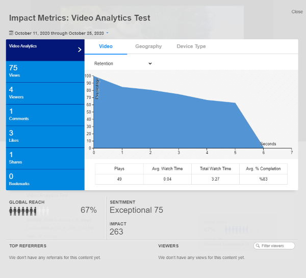
The Video tab shows how people watch your video:
- Average view duration
- The average watch time metric shows the average time the video has been watched.
Average watch time = the time the video has been watched in the selected period / the total number of unique users - Play rate
- The Plays metric shows how many times the video has been played. In this, plays are different from views: views count the openings of the video page, while plays count the times user started watching the video, including replays.
- Audience retention
- The retention metric shows how viewers watch your video. Do they watch till the end or stop in the middle?
- Total Watch Time
- This metric shows the total time the video has been played after its creation.
- Avg. % Completion
- This metric shows which part of the users watched the video till its end. This value is counted for all time the video exists.
The Geography tab shows playback locations where people are engaged. This may be especially relevant for geographically spread communities.
- Where the video was played
- The graph under visually demonstrates where you where the video is played the most – or the least.
- Playback locations versus watch time
- The tables under present you the total views by country and the average view duration based on where the video was played.
The Device Type tab segment views by device.
- Views by device
- Jive segments all views by device type: desktop, mobile phone, or tablet. If the device cannot be recognized the view is counted under unknown.
For more technical information on how impact metrics are counted and how you can use them to your advantage, see Deep Dive: Impact Metrics on Worx.